Overview:
The most fundamental tool of TreePlotter™ CANOPY is the view tool. This tool allows a user to see the distribution of tree canopy cover, planting space, and all land cover classes. This tool is compatible with all geographic assessment boundaries.
Three slider boxes are shown below the geographic boundary drop-down. These sliders control the features displayed on the map. Users can click and slide the toggles on the slider bar to remove any areas whose tree canopy metrics do not fall within the specified range.
Only one category can be shown on the map at a time. The active layer is indicated by a blue radio button in the upper left-hand corner of the slider box. The active layer will be listed in the legend and shown on the map. Hovering the cursor over any feature displays a summary popup of specific percentages.
Instructions to Use the View Tool:
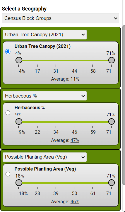
Step 1 – Select a Geography:
Select the geographic boundary of interest by using the block drop-down arrow. Any assessment scale can be viewed in this tool. Once chosen, the selected geography will be displayed on the map. This example shows Census Block Groups as the chosen assessment scale.
Step 2 – Select a Metric:
This step is shown in the example to the right. The metric that’s currently shown on the map is marked with a blue radio button in the top left corner. The example image shows Urban Tree Canopy 2021 as the selected metric. To view a different metric, like the Possible Planting Area or the percentage of Herbaceous land, click the radio button next to the metric you’re interested in.
Step 3 – Filter Data:
A user can filter what is shown on the map by clicking and sliding the toggles on a slider bar to select certain percentage ranges. When you set filters, areas that don’t match your chosen criteria will disappear from the map. For example, if you slid the top Urban Tree Canopy (2021) slider to 17%, all the census block groups that have less than 17% canopy would disappear from the map.
This can be done with one metric at a time or a user can also filter multiple metrics at one time (seen below). In this instance, the user could select a main metric (UTC), filter it by toggling the slider bar, and then filter a second metric (PPA) to see the areas that have both high UTC and high PPA.
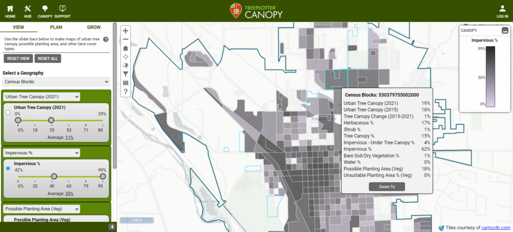
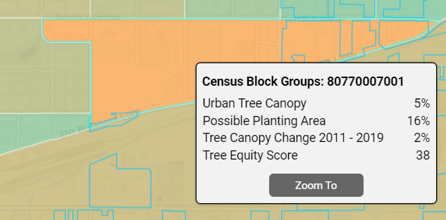
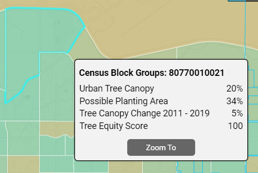
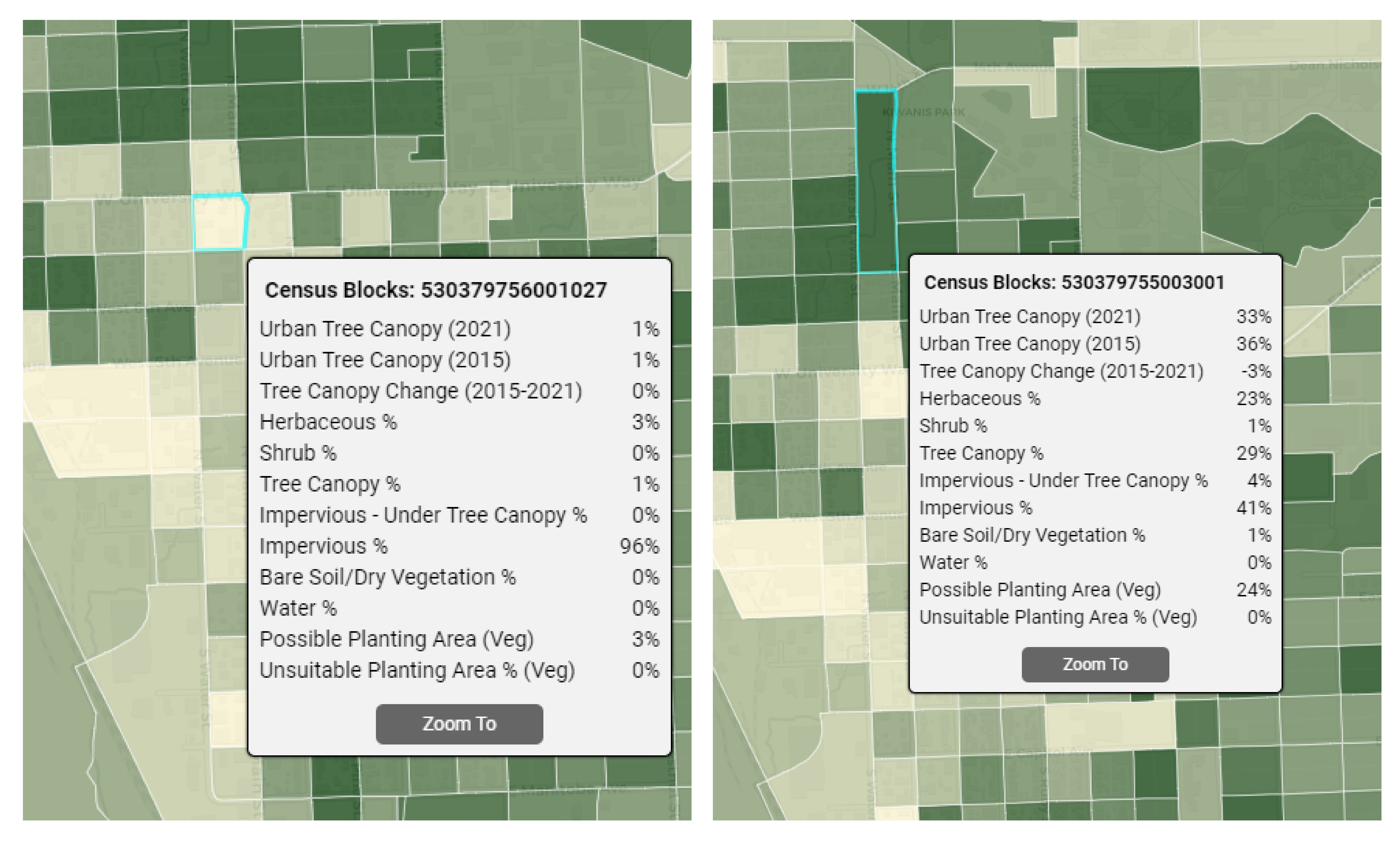
Selecting a feature: To view the unique land cover metrics for a specific feature on the map, click on that feature. A pop-up will display all the relevant data, and the selected area will be highlighted in bright blue. (Seen in example above)
Understanding the Metrics:
Some of the colors in the images below may look different in your TreePlotter CANOPY application. The metrics and how they work within your application will be the same.
Slider Box 1:
The first slider box contains three unique metrics related to urban tree canopy. Within this box, the user will be able to toggle their near-current canopy, historical canopy, and canopy change between the two years.
Urban Tree Canopy (UTC): Urban Tree Canopy is the layer of leaves, branches, and stems that provide ground cover, as seen from above, and usually extends over 10-15 feet high (Raciti et al., 2006).
To calculate this metric, the area covered by tree canopy is divided by the total land area, excluding water, and expressed as a percentage. This percentage is then incorporated into your TreePlotter CANOPY application.
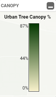
The Legend, located in the top right corner of the application, will display the varying percentages of Urban Tree Canopy throughout your area of interest.
The darker the color of the polygon, the higher the percentage of Urban Tree Canopy for that area.
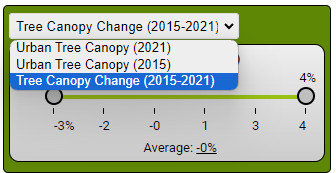
Tree Canopy Change: Tree Canopy Change is the change of tree canopy over a range of years. This metric is extremely useful when determining how a weather event, invasive pest, or tree planting initiatives may have affected tree canopy.
Tree Canopy Change will be positive if the tree canopy has expanded over the time frame. Tree Canopy Change will be negative if tree canopy has decreased in an area over time.
The years of the Tree Canopy Change are listed in the View Tool, in the pop-up, and on the Tree Canopy Change legend. The years may differ depending on when the data in your area became available. The Legend in the top right corner of your application will provide a range of percentages for the change in Tree Canopy.
Darker green polygons signify a greater increase in canopy cover.
Slider Box 2:
This box lets you switch between different types of ground cover.
This tool is beneficial for identifying areas with high concentrations of impervious surfaces or regions where bare soil and dry vegetation are most prevalent within the selected geography.
Each landcover class in this slider box was determined by dividing the area of that specific landcover class by the total area, which includes water bodies.
Slider Box 3:
This third slider box can be used to show available plantable space. On the other hand, unsuitable areas can be shown as well.
Unsuitable Planting Areas: Vegetated areas where it would be feasible for tree plantings
but undesirable based on their current usage. These areas included recreational sports fields, golf courses, and other open spaces.
The darker the color of the polygon, the higher the percent of Possible Planting Area available.
Possible Planting Area: Possible Planting Area refers to spaces like grassy areas, open spaces, or shrublands where there are no trees right now, but it’s possible to plant them. Areas like sports fields, utility paths, and other “unsuitable areas” are not included in this measure.
To calculate this, the total area where trees can be planted is divided by the total land area, excluding water.
The Legend in the top right corner of your application will show the range of Possible Planting Area percentages within all of the geographic boundaries. You can learn more about Possible Planting Area in this support article here.
Known limitations:
- By default, all metrics will be shown in the popup. This can be customized upon request.
- The location of the pop-up can not be moved.
- The order of the slider boxes can be adjusted upon request.
- The filters will reset if a new geography is chosen.
Potential Next Steps:
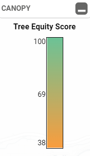
UK Tree Equity Score: Tree Equity Score is a metric created by American Forests. This metric can be seen in the View and Plan Tool. Here, we will just talk about how the metric is seen in the View Tool. For more information on the Tree Equity Score and how it is calculated, check out our support article here.